Visualize task graphs#
|
Visualize several dask graphs simultaneously. |
Before executing your computation you might consider visualizing the underlying task graph. By looking at the inter-connectedness of tasks you can learn more about potential bottlenecks where parallelism may not be possible, or areas where many tasks depend on each other, which may cause a great deal of communication.
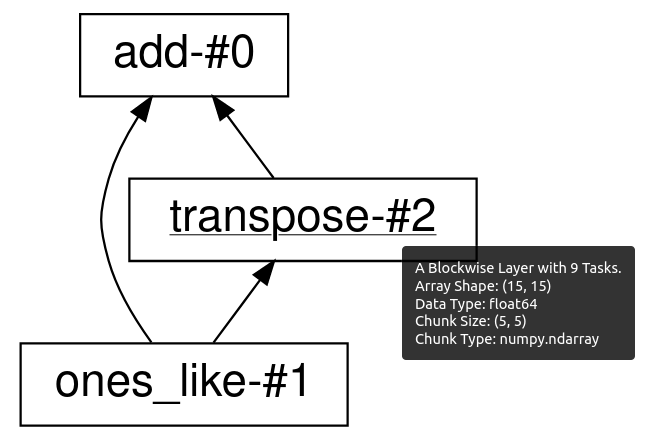
Visualize the low level graph#
The .visualize method and dask.visualize function works like
the .compute method and dask.compute function,
except that rather than computing the result,
they produce an image of the task graph.
These images are written to files, and if you are within a Jupyter notebook
context they will also be displayed as cell outputs.
By default the task graph is rendered from top to bottom.
In the case that you prefer to visualize it from left to right, pass
rankdir="LR" as a keyword argument to .visualize.
import dask.array as da
x = da.ones((15, 15), chunks=(5, 5))

y = x + x.T

# y.compute()

# visualize the low level Dask graph
y.visualize(filename='transpose.svg')

It is often helpful to inspect the task graph before and after graph optimizations
are applied. You can do that by setting the optimize_graph keyword.
So the above example becomes:
import dask.array as da
x = da.ones((15, 15), chunks=(5, 5))

y = x + x.T

# visualize the low level Dask graph after optimizations
y.visualize(filename="transpose_opt.svg", optimize_graph=True)

The visualize function supports two different graph rendering engines: graphviz
(the default), and cytoscape. In order to change the engine that is used, pass the
name of the engine for the engine argument to visualize:
import dask.array as da
x = da.ones((15, 15), chunks=(5, 5))

y = x + x.T

# visualize the low level Dask graph using cytoscape
y.visualize(engine="cytoscape")
You can also set the default visualization engine by setting the visualization.engine
configuration option:
import dask.array as da
x = da.ones((15, 15), chunks=(5, 5))

y = x + x.T

with dask.config.set({"visualization.engine": "cytoscape"}):
    y.visualize()
Note that both visualization engines require optional dependencies to be installed.
The graphviz engine is powered by the GraphViz
system library. This library has a few considerations:
You must install both the graphviz system library (with tools like apt-get, yum, or brew) and the graphviz Python library. If you use Conda then you need to install
python-graphviz, which will bring along thegraphvizsystem library as a dependency.Graphviz takes a while on graphs larger than about 100 nodes. For large computations you might have to simplify your computation a bit for the visualize method to work well.
The cytoscape engine uses the Cytoscape javascript
library for rendering, and is driven on the Python side by the ipycytoscape
library. Because it doesn’t rely on any system libraries, this engine may be easier
to install than graphviz in some deployment settings.
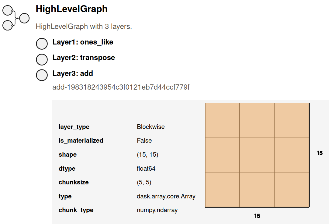
Visualize the high level graph#
The low level Dask task graph can be overwhelming, especially for large computations.
A more concise alternative is to look at the Dask high level graph instead.
The high level graph can be visualized using .dask.visualize().
import dask.array as da
x = da.ones((15, 15), chunks=(5, 5))
y = x + x.T

# visualize the high level Dask graph
y.dask.visualize(filename='transpose-hlg.svg')
Hovering your mouse above each high level graph label will bring up
a tooltip with more detailed information about that layer.
Note that if you save the graph to disk using the filename= keyword argument
in visualize, then the tooltips will only be preserved by the SVG image format.
High level graph HTML representation#
Dask high level graphs also have their own HTML representation, which is useful if you like to work with Jupyter notebooks.
import dask.array as da
x = da.ones((15, 15), chunks=(5, 5))
y = x + x.T

y.dask  # shows the HTML representation in a Jupyter notebook
You can click on any of the layer names to expand or collapse more detailed information about each layer.